Modal
Appears on top of and disables the main content until it has been explicitly interacted with
Modal overlays are used to present a short-term task that the user needs to perform. It is intended to be a supporting UI element to a page, which highlights a critical task or decision the user needs to do without losing context to the underlying page.
Examples of modal usage could be for presenting critical information which requires a response, or additional information which can guide the user to what they need to do on a page. Whilst modals can be versatile in their usage, they are also not fit for use for all purposes, and care must be taken as to not use modals for more complex interactions which may potentially require their own page.
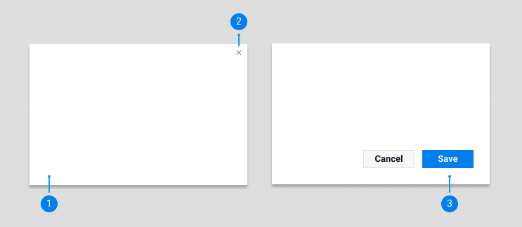
At its core a modal is essentially a card that overlays the page, however it must always be dismissable by the user, whether by a close icon on the top right or via call to action buttons or links.

1) Card : The base card component to house the modal (see
2) Close icon : The close icon to dismiss and close a modal, which sits within the modal margins to be separate from the content within a modal.
3) CTA actions : Any buttons or links that complete the modals intended action and close the modal
With regards to the anatomy and hierarchy of content within modal this should follow the general guidelines set for
Examples of modal types can be seen in code view.
Default
Appears on top of the page and disables the main content. Can be dismissed via the close icon or call to action buttons or links, or by clicking outside of the mobile area. For use in general situations where the modal contains less important or trivial interactions for the user who can easily dismiss the modal.
Closeable
Can only be dismissed via the close icon or call to action buttons or links. Used for critical interactions where the user MUST perform an action or acknowledge some information.
Edge to edge
Modals in which the content of the modal fills the full card, and doesn’t have the padding around the edges. For use on modals that fulfill purely display purposes, such as an image gallery.
Mobile fullscreen
On mobile modals will fill the entire screen. Similar to desktop they can be dismissed via a close icon or call to action buttons or links, but they may also be dismissed via the standard back arrow on the primary navigation bar at the top.
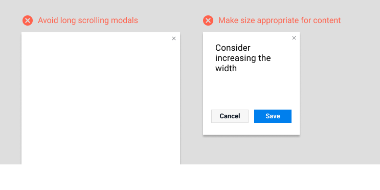
Modals for use on Freelancer.com are available in a number of sizes. Please use the size that is appropriate for the content of the modal. Consideration must also be taken too as to not make a modal scale too long vertically, as modals should fit wholey within a screen and users shouldn’t have to scroll down in order to view all content on a modal.

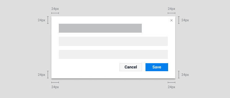
In order to keep the visual alignment consistent across all our modals, please keep at uniform 24px padding between the edges of the content and the side of the modal. The exception to this is the ‘Edge to edge’ modal, which allows content to expand to the borders.
