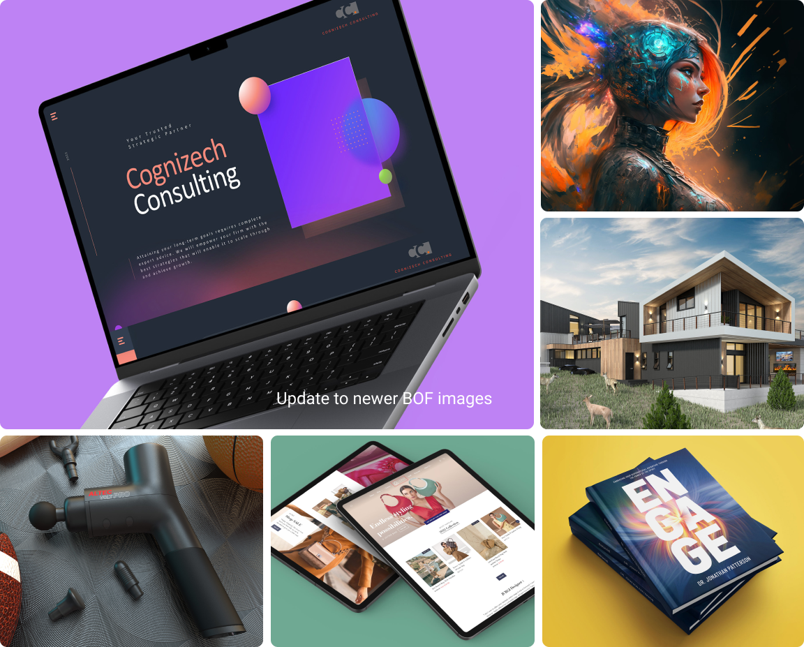

.brand
Brand principles
This document is your guide to our brand. We're passionate about nurturing it, and it thrives when we maintain consistency across all interactions. Use this guideline for everything related to our visual identity, and let's work together to make our brand truly remarkable.
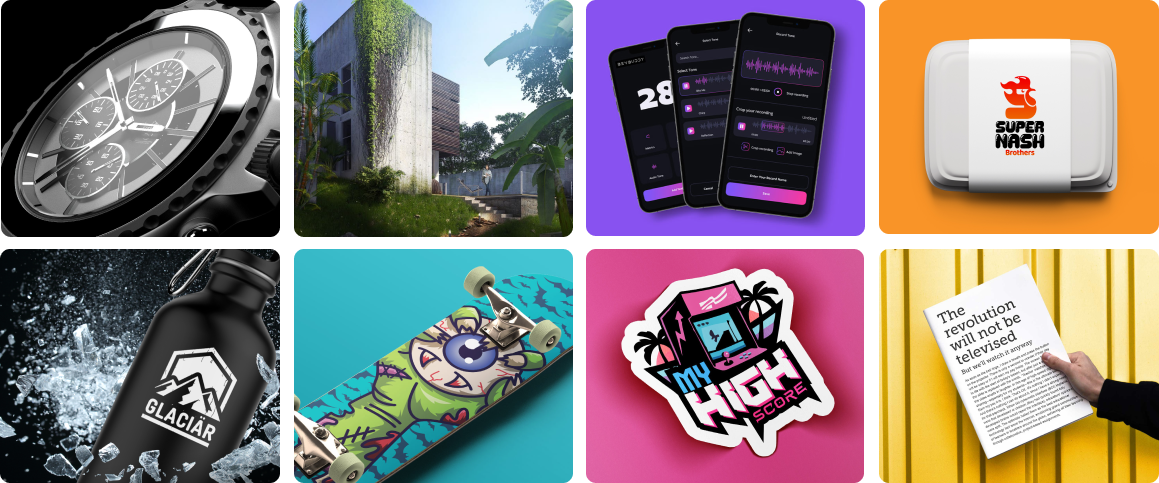
Mission
Empowering entrepreneurs globally through the world's largest marketplace for freelancing and crowdsourcing.
Vision
To change a billion lives on this planet by giving them opportunity and income through a job.

Brand values
Our brand values are rooted in our mission to empower entrepreneurs globally through the world's largest marketplace for freelancing and crowdsourcing and can be drawn upon to guide future design explorations.

Change lives
Transforming lives and providing opportunities to connect, collaborate, and thrive in the ever-evolving digital landscape.

Innovation
Cutting-edge technologies opens doors to remote work, breaking down geographical barriers and expanding opportunities for professionals worldwide.

Inclusivity
A vast talent pool covers diverse industries and offers equal opportunities for professionals to showcase their skills and connect with clients globally.
The Logo
The logo is the core element of any Freelancer branded communication. It is an instantly recognisable symbol of the brand, and it is important that it is used as specified in these guidelines. The
Freelancer logo is made of a combination of two key elements:
1. The Freelancer bird
2. The wordmark
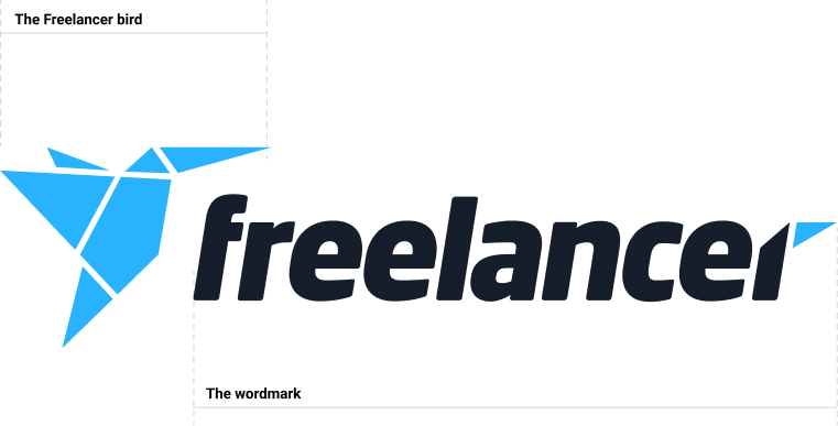
The freelancer bird

In certain circumstances we prefer to use the Freelancer bird icon on its own rather than the full logo. These may be physical situations where horizontal space may be an issue, or design driven situations where we want the logo to appear more recessive, acting more like a subtle sign-off.
If the Freelancer bird is going to be used on its own, please ensure that the Freelancer brand is established through other means ie. use the full logo elsewhere, in imagery, in copy or tone of voice, as outlined throughout this document.
Logo colours
The Freelancer logo, black and blue, is our primary logo colorway and should be used on white and light coloured backgrounds.
The Freelancer logo, black and blue, is our primary logo colorway and should be used on white and light coloured backgrounds.The Freelancer logo, white and blue, should be used on black or dark coloured backgrounds.
The logo is always black and blue or white and blue.
Never use the logo all white, all black or all blue.


Exclusion zone
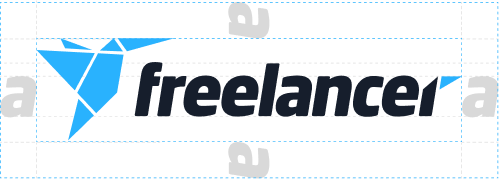
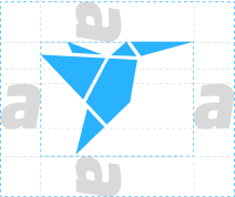
The Exclusion Zone ensures the legibility and impact of the Logo by isolating it from competing visual elements such as text and supporting graphics.
This zone should be considered as the absolute minimum safe distance. In most cases the Logo should be given even more room to breath.
The Exclusion Zone is equal to the horizontal distance of the letter 'a' from the Freelancer logo.
Logo misuse
It is important that the appearance of the Logo remains consistent.
The Logo should not be misinterpreted, modified, or added to. No attempt should be made to alter the Logo in any way. Its orientation, colour and composition should remain as indicated in this document — there are no exceptions.
To illustrate this point, some of the more likely mistakes are shown on this page.

Do not in any way manipulate the relationship between the bird and the text. Do not reposition where the bird sits relative to the text.

Do not separate the bird from the text. The logo consists of the bird and text.

Do not make the logo one colour.

Do not outline or keyline around the logo.

Do not switch the colours of the bird or text.

Do not rotate the logo.

Do not apply a gradient to the bird or text.

Do not change the typeface or otherwise recreate the text. Use only the provided files.
Logo lockups
We have sub brands of Freelancer.
Freelancer font is Neo Sans Std Black Italic.
Sub brand font is FF Clan Regular.


Primary colours
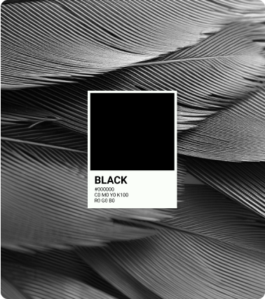
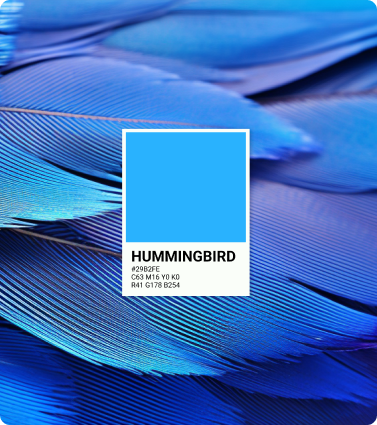
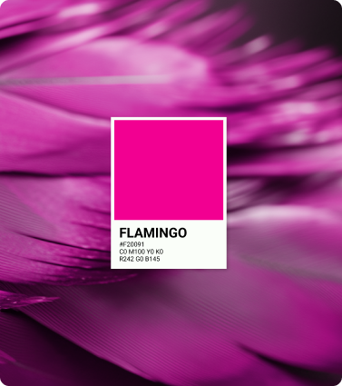
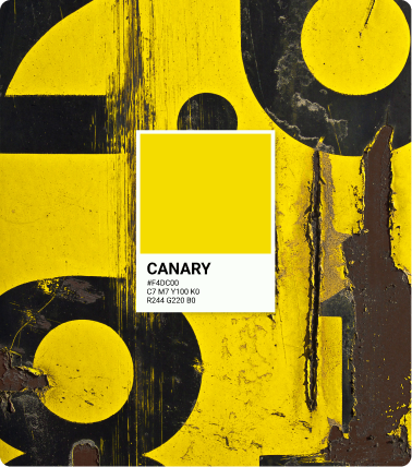
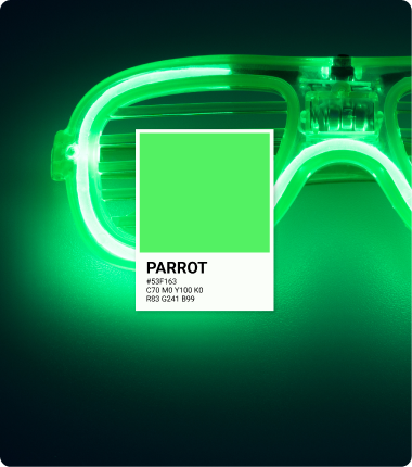
The primary colour palette is black, hummingbird blue and flamingo pink. The Freelancer brand celebrates a diverse and global culture, and is always bold and vibrant. However, we also remain grounded with these three primary colours as our core palette.
Secondary colours
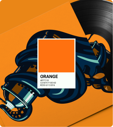
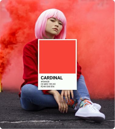
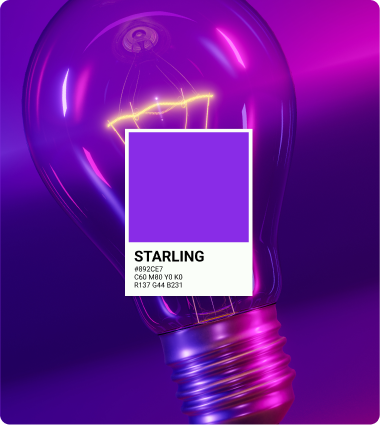
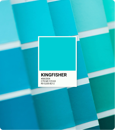
Our brand communications must also must also allow us to design with a bold and colourful expression. Aside from the three primary colours outlined above, we also use a varied and nuanced communications palette, with just enough options to keep things feeling fresh, yet coherent.
These colours have also been selected to be bold and vibrant. It is important that you don't use colours in a brand communication that is not in the colour palette. In order to maintain this bold, vibrant look to our design it is important not to use tints on branded communications.
Applying colours
We have a diverse colour palette to suit various themes, but it's crucial to ensure that one specific colour serves as the dominant visual anchor on the page. Monotones (black and white) are not considered this dominant colour.
Note that you may always use multiple colours in a branded communication, just ensure that there is one that is visually dominant.

Typography
Typography is an essential element of our identity and a powerful tool for achieving consistent expression in our communication.
Roboto is a typeface that is accessible by most systems. It was designed entirely with digital products and screens in mind. The perfect font for the Freelancer brand.
The font boasts friendly and open curves. Unlike some grotesque fonts that distort letterforms to impose a rigid structure, Roboto maintains the natural width of letters. This results in a more fluid reading experience, akin to what you'd typically find in humanist and serif typefaces.

Type weights
Roboto exists with a variety of different weights and types, but for Freelancer branded designs we limit this to five key weights:
These variations are more than enough to create any required hierarchy for text for any Freelancer branded communication.
Avoid using too many different font weights. Use only the minimum necessary to establish text hierarchy or emphasise key points.

A B C D E F G H I J K L M N O P Q R S T U V W X Y Z
a b c d e f g h i j k l m o n p q r s t u v w x y z
0 1 2 3 4 5 6 7 8 9 0 @ # & ? ! ~ $ % . ,

A B C D E F G H I J K L M N O P Q R S T U V W X Y Z
a b c d e f g h i j k l m o n p q r s t u v w x y z
0 1 2 3 4 5 6 7 8 9 0 @ # & ? ! ~ $ % . ,

A B C D E F G H I J K L M N O P Q R S T U V W X Y Z
a b c d e f g h i j k l m o n p q r s t u v w x y z
0 1 2 3 4 5 6 7 8 9 0 @ # & ? ! ~ $ % . ,

A B C D E F G H I J K L M N O P Q R S T U V W X Y Z
a b c d e f g h i j k l m o n p q r s t u v w x y z
0 1 2 3 4 5 6 7 8 9 0 @ # & ? ! ~ $ % . ,
Brand voice
Our brand's tone of voice is conversational and concise, aiming to establish a friendly and approachable connection with our audience. We strive to communicate in a manner that feels like a conversation between friends while conveying information efficiently and effectively. This tone allows us to engage and connect with our audience in a relatable and personable way, fostering trust and building lasting relationships.

Examples
Welcome message
"Hey there! Welcome to our community. We're thrilled to have you on board. We'll be here to guide you every step of the way. If you have any questions, don't hesitate to reach out. Let's embark on this exciting journey together!"
In this example, we greet our audience in a warm and friendly manner, using informal language to create a welcoming atmosphere. We convey our readiness to provide assistance and emphasize the idea of collaboration, inviting our audience to engage with us.
Product description
"Our new feature is a game-changer. It's compact, lightweight, and does wonders for your productivity. With its sleek design and powerful features, you'll be amazed at how it simplifies your daily tasks. Say goodbye to complexity and hello to efficiency!"
Here, we use concise language to highlight the key benefits of our product. The tone remains conversational, emphasizing the positive impact it can have on the audience's life. We appeal to their desire for simplicity and efficiency, creating excitement and anticipation.
Error message
"Oops! Looks like something went wrong. Don't worry, we've got you covered. Our team is on it and working hard to fix the issue. Hang tight, and we'll have everything back to normal in no time. Thanks for your patience!"
Even in error messages, we maintain a conversational tone to reassure our audience. We acknowledge the problem, offer support, and provide a timeframe for resolution. By expressing gratitude for their patience, we convey our commitment to delivering a positive user experience.
Write in US English
We've positioned ourselves as a .com, not a .com.au or .co.uk. Our users come from all over the world, but write to a US audience. This means no OUs, lots of Zs and R after E. It also means you traveled illegally instead of travelled illegally, forged a check instead of a cheque, faced judgment instead of judgement, got sent to jail instead of gaol and ended up in a correctional center, not a correctional centre.
We are Freelancer
When writing internally, we're Freelancer. Never Freelancer.com, freelancer.com and never freelancer. When writing for external sites or publications, we're Freelancer.com.
Emails and marketing comms
The subject line should be no longer than 90 characters. A good subject line should contain at least one of the following five elements:
Self interest
"Your free project upgrade is inside"
Clearly state the benefit your recipient will get from the content of the email.
Curiosity
"9 out of 10 successful startups do this"
Pique the recipient's curiosity by asking a question or making a bold statement.
Fear of missing out
"Only 24 hours left to save big"
Create a sense of urgency or scarcity to prompt recipients to take action.
Social proof
"Millions of happy freelancers can't be wrong"
Leverage recipients inclination to follow the crowd.
Offer
"Save 50% on our top selling membership"
Similar to self-interest, be clear about what your email is offering the recipient.
Remember, our conversational and concise tone of voice helps us establish a connection with our audience while effectively communicating our brand's message.
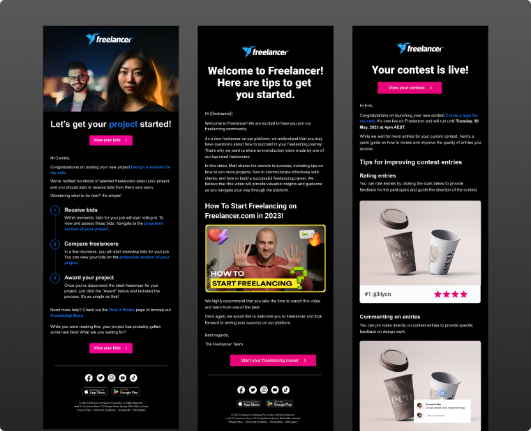
Your email body should consist of:
Keep your body copy concise. Ideally, a recipient should be able to skim your entire email and see the CTA without scrolling down on mobile devices. Your call to action should be a prominent button, no more than two to three words long, and headline cased.
Your email also MUST contain a footer with our address, an unsubscribe link, our app store links and social media links.
Brand tagline
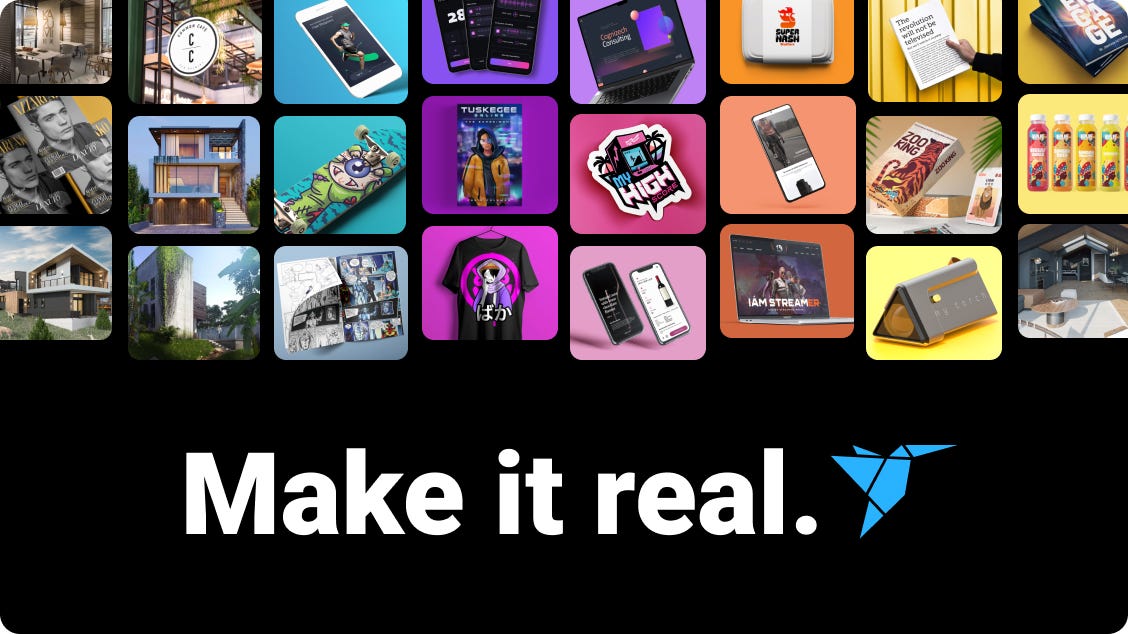
Our tagline can be expressed in any font, colour or styling just like the MTV logo appeared in countless mediums, styles and iterations.



Imagery
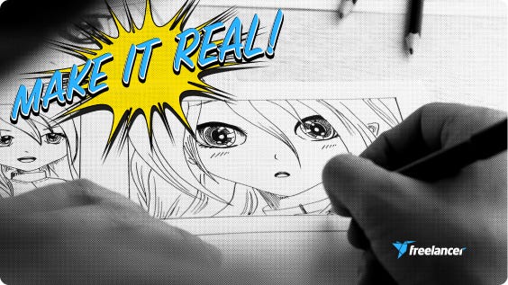
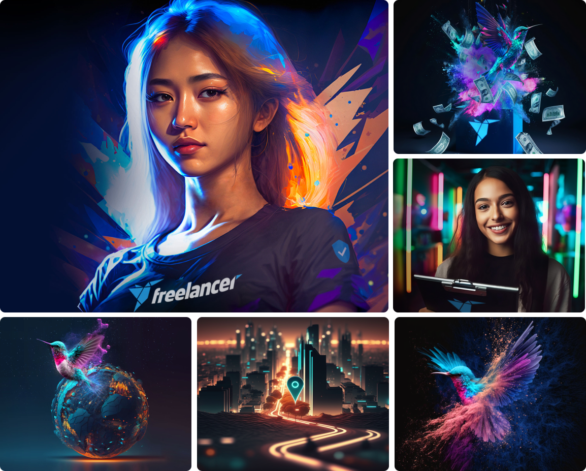
The Freelancer brand is bold, vibrant, dynamic and global. The imagery used at Freelancer should reflect this, whilst still also being relevant for the product or promotion where it is used.
Our brand style is continually evolving and expanding. To maintain some consistency lean towards making your images dark but vibrant with high contrast, saturated colours, with a neon or synthwave style. Images need to look highly realistic rather than any particular style.
Best of Freelancer
Show the best freelancers' work in the best way. Make the visuals compelling. We want to tell the story behind the work, and what led to a dream becoming real.
