Link
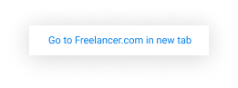
Anchor tags used for embedded links or smaller actions
The link component should be used when creating navigational actions that are part of a line of text, or for less-prominent actions where a button is too big.
Contents
A link is an interactive component that allows a user to easily navigate through another section or page.

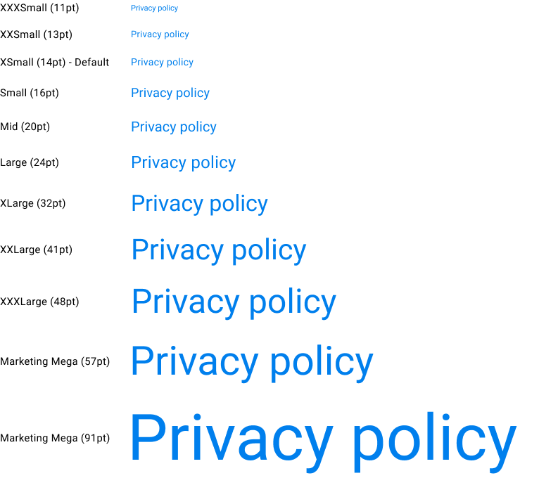
Links are displayed in the following sizes:
There are five color variants of the link component:
Default

White

Light

Inherit

Dark

All links should have clear labels.
Text links should be understandable and independent of the text surrounding it. Avoid using ambiguous words such as click here or learn more.
Do

Don't

Use the most relevant keywords
In an eye-tracking research study conducted by the Nielsen Norman Group, most people look at the first 2 words of a link.
Do

Don't

Use color to indicate a link
Blue is the standard choice of color for links. If selecting a different color, ensure that it looks clickable.
Do
Don't