Drawer
An overlay panel that slides in to display additional content
A drawer is a modal that appears over existing content and anchors to the edge of the screen.
Drawers are used to display additional content and functionality in the form of a modal that slides in from the edges of the screen. They allow users to vertically scroll and perform additional tasks that can’t be done on the original screen.
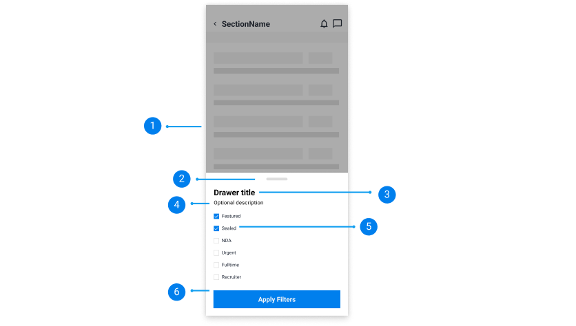
Dark overlay:
Shadow overlay on the background content.
Drawer swiper:
A visual element for users to swipe and drag to open or close the drawer.
Drawer title:
A left aligned short title.
Optional description:
Quick description or message to provide more context.
Drawer content:
The drawer component is versatile and can display any contents and other components such as a checkbox.
Call-to-action button(s):
A primary button or multiple primary call-to-actions that allow the user to save their progress or continue through.
There are two types of drawers:
Modal:
Modal drawers appear from the edge of the screen and create a backdrop that disables the interaction of the original content. They are used to help users focus on completing additional tasks.
Standard navigational::
Standard navigational drawers appear from the left-hand side of the screen, which sits on the same surface elevation as the main page content and contains no overlay. Instead, it moves the main page content around to make space for the drawer.
Drawers can be opened by clicking a button or an icon button. They can be closed by clicking the same button that triggered it or by clicking outside the drawer.
There are animations that can be shown when a drawer appears. They are:
Sliding animation
Drawers appear by a sliding-in animation from the left, right, top or bottom edge of the screen.
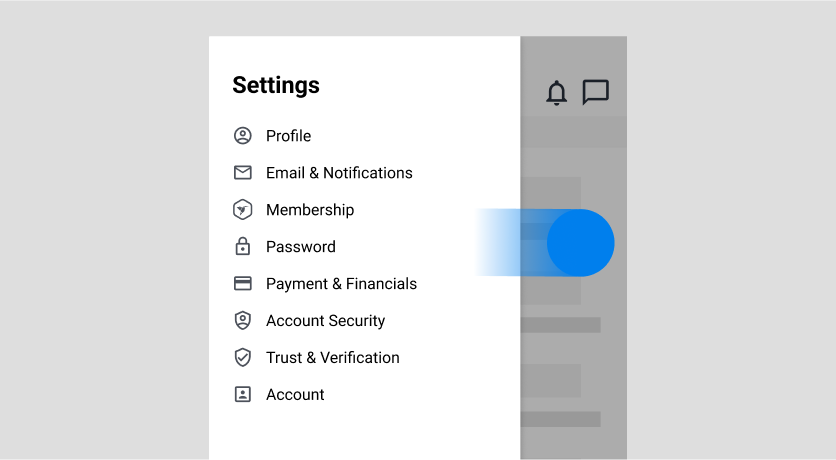
Swipe (Mobile)
The drawer component can be opened or closed using a swiping motion on mobile. Users can also resize the drawer to display more or less contents and actions.
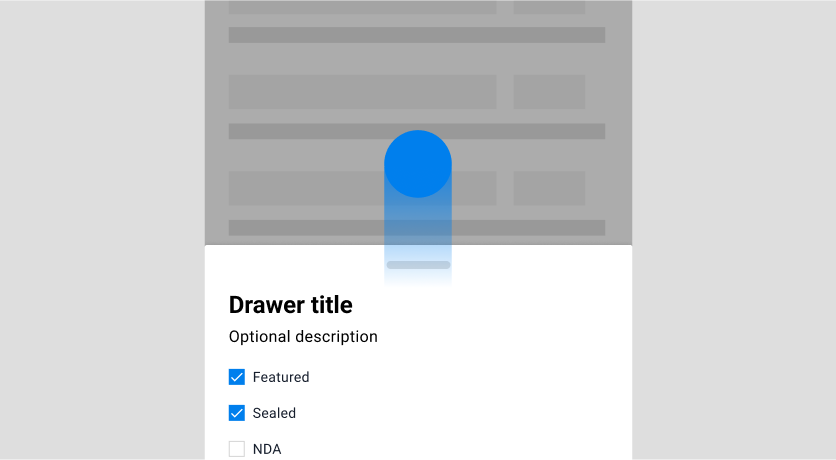
Drawers can appear on the left, right, top or bottom side of the screen. The size of the drawer can vary depending on the content shown.
Modal drawers appear above the original content. They cover parts of the main content depending on its size and contain a backdrop overlay that emphasises the drawer content.
Standard navigational drawers appear on the same surface as the original content. They move and resize the main content around to fit the drawer on the same screen.
Adjust the drawer height accordingly to fit content.
A drawer height should be adjusted accordingly to the content inside. Avoid making the drawer content too long or short for scrolling purposes. If the content inside is long and appears cropped, allow users to vertically scroll the content.
Do
Don't
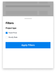
Ensure the content of the drawer is succinct and relevant.
Display content in the drawer that helps users reach their end goal by placing related information and functionalities.
Do
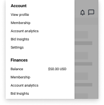
Don't
