Tooltip
A tooltip is a floating, non-actionable label used to explain a UI element, feature or to provide additional information.
Contents
A tooltip is used to display extra textual information about a UI element when the user moves their pointer over an element. The tooltip is a wrapping component around the desired content to be displayed.

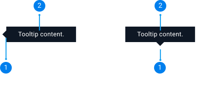
Tooltip content : Short description or information to help the users.
Tooltips appear on hover over text or on icons. It is used to provide additional information on a piece of text or an element of the UI. Common uses for text tooltips include: explaining jargon and displaying important (but non-critical) information related to the product or flow. Critical information should always be displayed prominently on the UI. Tooltips can be shown on system icons such as Membership badges or on the default tooltip icon (see below).

Tooltips can be used on existing icons (such as a memberships badge) or the default tooltip icon. The default tooltip icon is the ‘’i’’ information icon. The default tooltip icon can be placed next to any UI element to provide additional supporting information. It can be used instead of a text icon and is easily recognisable. In most situations, it is safer to use the default tooltip icon instead of a basic text tooltip as it provides more visibility. Please be careful not to clutter the UI with an excessive number of tooltips.
![]()
![]()
The default icon for tooltips is the "i" information icon. The “?” question icon is used for the callouts component.
Uses and examples
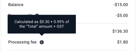
The "i" information icon is best used with tooltips to provide additional information that the user might not have but will still be helpful. For example, the "i" icon with tooltips tells the user how a processing fee is calculated, this information is short, helpful and provides additional context.

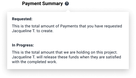
The "?" icon is best used with a callout to explain a feature or a product. Use this to offer general information that users might ask, such as a definition of a feature. For example, "?" is used to explain the different payment processes using a callout component. A detailed explanation is provided within the callout to help users better understand an aspect of the product, there may be links inside the callout component for additional help. Learn more about the

Default 
Light 