Toast alert
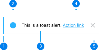
Toast alerts are displayed at the top and center, just below the header nav.
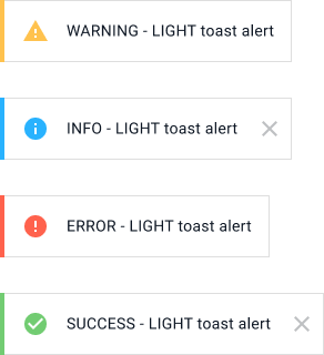
Toast alerts are meant to display quick one-line NON-CRITICAL messages for a glimpse such as success, warning, error etc.
Make sure for any new Toast Alerts being added to use the dynamic alerts. These are more performant. We will be removing non dynamic alerts.
Toast alerts are designed to display concise non-critical messages such as an update, success state, warning, error or loading. They appear at the top and center of the display, just below the header nav.
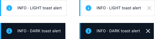
Use to convey general information or confirmations that aren’t ciritcal.
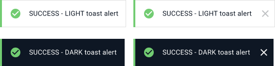
Use to indicate that something was successful.
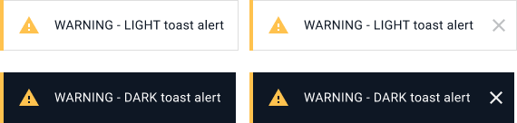
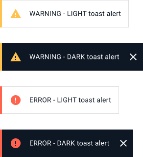
Use to display information that needs attention or that users need to action on before something goes wrong
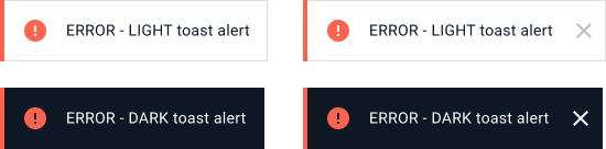
Use to inform users that something has gone wrong. Reserve it for errors not caused by the users such as a connectivity issue.
Use to show users that something is currently loading
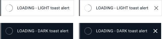
Non-Closeable and Closeable Toasts
Allowing users to close toasts banner could provide a better user experience, eitherway, toasts should automatically disappear within 10 seconds
Light and Dark color variants
Use light toast when the background it will appear over is dark. Use dark toast when the background it will appear over is light
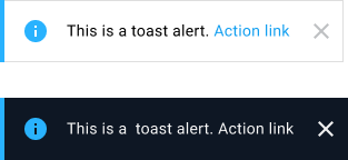
Toast with Action Link
Only include an action in toast if the same action is available elsewhere on the page. Keep the action label short, preferably 1 verb. For example: give users the option to Undo when they have done something like deleting an image.
Toast copy should be a short, concise and informative sentence
Please keep in mind translations when you are writing your toast copy +/- 20 characters.
Do

Don't

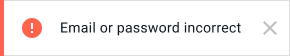
Toasts shoud rarely be used for error messages (Use Error and Critical Banners instead)
Reserve toasts for errors that are not caused by the users such as connectivity issue or backend issues. Use banners for other types of errors and error validation for input fields error.
Do

Don't