File select
User interfaces for file attachments
This is ONLY a UI component, it does not provide file upload functionality. Use value of your control to access the last file inputted by the user. This component can be used in 2 modes depending on the input to fileSelectMode: 1. DRAGDROP: user interface for dragging and dropping 2. ICON: cilckable icon to open the file explorer and select files
Contents
Document uploads enable users to upload file contents of their choosing. A file can be uploaded through a button or by a drag-and-drop motion. A document upload component can be found in forms or part of a flow that requires a user to verify their details.
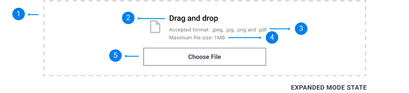
Drop zone:
A drop file zone where users can drag and drop file attachments to.
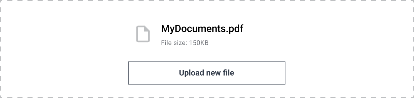
File name:
A visual element for users to swipe and drag to open or close the drawer.
File size:
A maximum size that is acceptable for the input file.
Upload new file button:
X.
Close button:
A button that reverts the user’s uploaded file and returns to the default upload state.
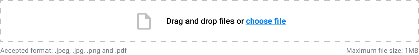
Default:
Default document upload has a smaller drop zone and places file format and maximum file size outside of the drop zone. And has an upload link instead of a button. Use this when screen space is limited.
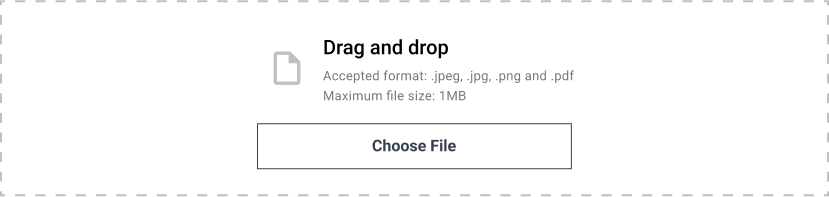
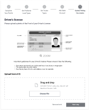
Expanded Mode:
Expanded view document upload specifies the accepted file format and maximum file size. It also has a large drop zone are for accessibility.
Active file upload
When users upload a file, the name of the file appears along with the size of the file.
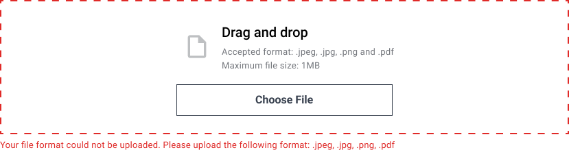
Drag and drop
Appears when the user drags a file on or across the drop zone.

Error validation
An error validation message appears underneath the drop zone when an incorrect file type has been uploaded or if the file exceeds the maximum size.
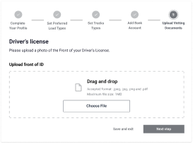
Give context on what to upload.
Provide a guide or description on what files to upload in 1 or 2 sentences. If its a photo upload, list details of what needs to be visible such as License number on a Driver’s License.
Do
Don't