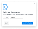
Callout
Popouts for rich tooltips
Contents
A callout appears when a user hovers over or clicks an element on a page. It can be used to display rich information that wouldn’t fit inside a tooltip, such as onboarding a new feature or product.
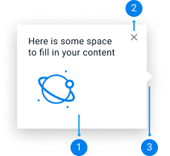
Default Callout
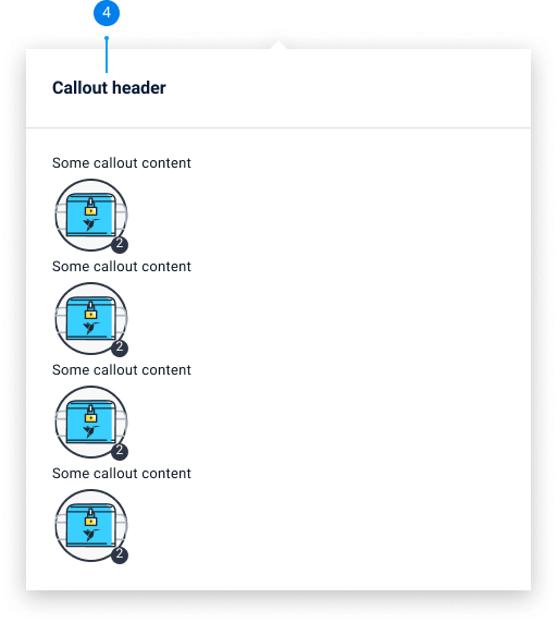
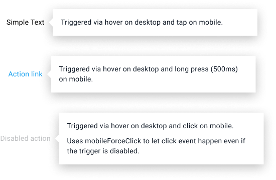
Default callout appears on hover over text or a feature. Use default callout to highlight new products/features or display rich information that wouldn't fit inside a
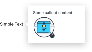
Default Callout with Icon
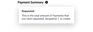
Default callout can be paired with a ‘’?’’ icon to explain a feature or a product. Use this to offer general information that users might ask, such as a definition of a feature. The "?" question mark icon indicates that extensive help and additional detailed information is available. The informational content within a question icon is more comprehensive than an information icon. Icon should always be 16x16
![]()
Onboarding Callout
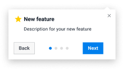
Use onboarding callout to introduce or highlight a new feature / product. Onboarding callout should include a close button, and it should darken the rest of the screen behind it to focus the users on the callout. It can also be a multi-step flow and can include icon, title, description, a page indicator (optional), next and back button (optional), link (optional). Onboarding callout appears as the user loads a page for the first time.

Hover
Default callouts appear while the user’s cursor is hovering over the element on desktop and on tap on mobile (Onboarding callout appears when a user loads into a page when introducing a new feature). The callout will disappear when the user’s cursor moves away from the element or the callout.
Clicked
When the element is clicked, the callout will appear and stay even when the user’s cursor moves away from it. The callout will disappear when the user clicks outside the element or callout.
Default
Width: Will scale according to its content
Small
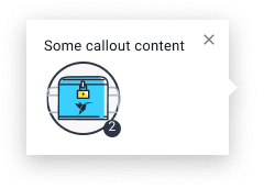
Width: 278px
Medium
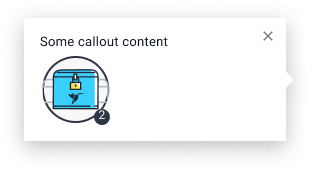
Width: 424px
Large
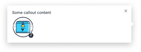
Width: 878px (example is not to scale)

Close Button
The close button is available for onboarding callouts, where the callout appears when the user loads into the page. The aim is to focus the users' attention on the callout and its content. Other callouts will disappear when the users' cursor leaves the element or callout; therefore, they don't need a close button.

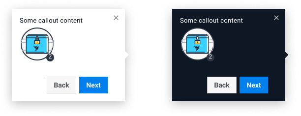
Light and Dark Color Variants
Use the light callout design when displaying over a dark background. Use dark callouts when displaying over a light background.

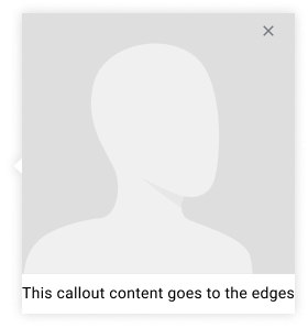
Edge to Edge
Sticky Button
Use buttons only for multi-step onboarding callouts, where there are multiple features that needs introduction (should only contain next and back buttons).
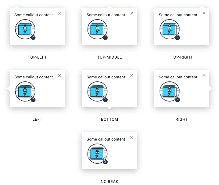
Beak Position
Callout beak position can be changed depending on the content of the page.
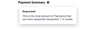
Callouts should not be used for short and simple hints (use tooltips instead)
Callouts should contain richer content that usually wouldnt fit in a tooltip, such as a definition of a feature or additional detailed help.
Do
Don't
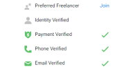
Use “?” icon for callouts
Use the “?” icon for callouts not the “i” icon. The icon should be 16x16 and the callout should appear 8 pixels appart from it.
Do

Don't
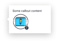
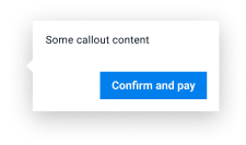
Refrain from putting important actions or forms in the callout
Callouts should mostly be used to present additional information, and should not contain important CTAs or forms, use cards or modal instead
Do
Don't
Only use multi-step callouts for onboarding
Callouts should only contain ‘back’ and ‘next’ button and should only be used when introducing multiple features or products within a page. Multi-steps callout should not be used for anything else, use cards and modals instead.
Do
Don't
