Dropdown filter
A button which displays a rich popout
The component is used to trigger a callout / rich popout to display the provided content. These are used to denote filtering or sorting options within the application.
Contents
Dropdown filters are a tool to allow users to select a value from a series of options.

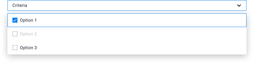
Default - multiselect
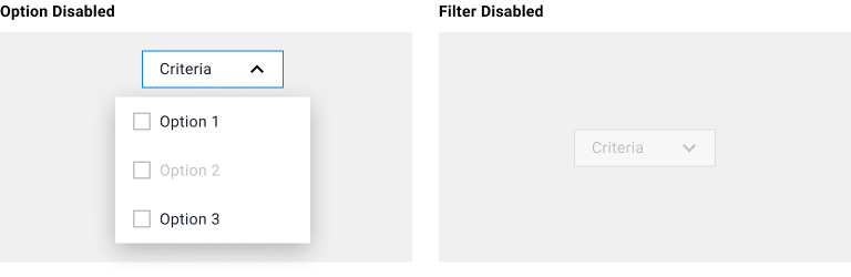
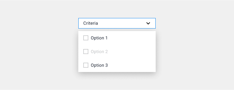
Default dropdown filter allows user to select multiple options on the list/menu. Users can click outside of the list/menu to close the dropdown filter.
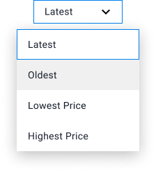
Single select
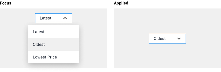
Single select dropdown filter allows user to select only one option. The dropdown list/menu will close automatically once the user selects an option. Single select filters are commonly used as sorting feature.
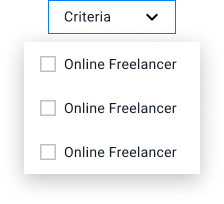
Fluid content size
Dropdown container that follows a content’s width.

Inherit content size
Dropdown container that follows a button’s width.
Dropdown icon
Hide dropdown icon
Icon label

Icon label/hide dropdown icon
Logo
Dropdown that is used to display saved payment card options
Full width
Dropdown that fills in the width of the container that it has been placed in.