Pagination
A simple pagination component
Displays additional controls if there are more than five pages (first, previous, next, last). Additionally, component will be hidden if total page count is one. Note that this component doesn't do any of the actual pagination logic, it just displays buttons.
Contents
Pagination is used to divide a large amount of content into smaller bits across multiple pages and allow users to navigate through them.

Arrow navigation
Buttons to navigate forward or backward from the current page.
Page number
A clickable link that allows users to select a specific page.
Selected page
An indication of the current page the user is viewing.
Truncation
When the maximum number of page has been reached, the list is truncated using ellipses.
Default
Default pagination for mobile and desktop.

Outline
Outline variant pagination for mobile and desktop.

Compact
Compact pagination displays how many items are shown on the current page out of the total number of items.

Initial state
Default pagination for mobile and desktop.

Active state
Outline variant pagination for mobile and desktop.

Initial hover state
Outline variant pagination for mobile and desktop.

Active hover state
Compact pagination displays how many items are shown on the current page out of the total number of items.

Disabled state
Compact pagination displays how many items are shown on the current page out of the total number of items.

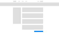
Place pagination at the bottom
Pagination should be placed at the bottom of the page and be visible to users.
Do
Don't
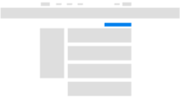
Show first and last page number upfront
Pagination should show the last page number upfront, which helps give the user an understanding of how many pages are available in total.
Do

Don't
