Banner alert

Banners which inform users about important things
Alert banners are one of the most prominent ways to communicate to users.

Usage

Banners are used at the top of the screen to display general information, warnings, success messages, error, and critical messages. Banners can be dismissible and can have action.

Anatomy

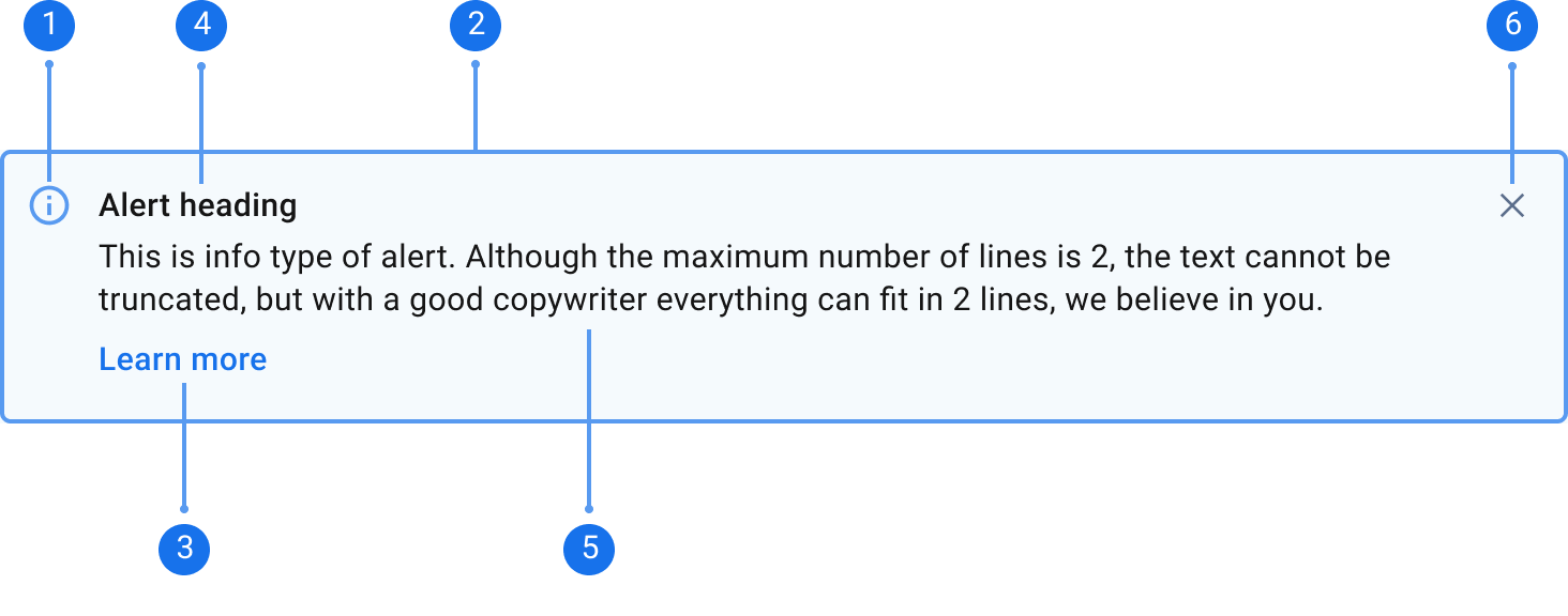
1. Side Bar: To indicate the type of banner using color.

2. Icon: To indicate the type of banner.

3. Action (optional): A link to a call to action.

4. Banner Title: Title of the message.

5. Banner Message: Body content, should be concise, should be no more than 2 lines.

6. Close Button (optional): To close the banner.

Appearance

Default/Informational Banners

Use Informational banners to convey general information, additional information, and actions that aren’t critical.

Alert heading
This is info type of alert. Although the maximum number of lines is 2, the text cannot be truncated, but with a good copywriter everything can fit in 2 lines, we believe in you.
Learn More

Success Banners

Use success banners to let users know if an action has been completed or accomplished.

Alert heading
This is success type of alert. Although the maximum number of lines is 2, the text cannot be truncated, but with a good copywriter everything can fit in 2 lines, we believe in you.
Learn More

Warning Banners

Use to display information that needs attention or that users need to act on before something goes wrong.

Alert heading
This is warning type of alert. Although the maximum number of lines is 2, the text cannot be truncated, but with a good copywriter everything can fit in 2 lines, we believe in you.
Learn More

Error Banners

Use to inform users that something has gone wrong and that they need to act upon it. Explain the problem and provide the user with a next step or a solution.

Alert heading
This is error type of alert. Although the maximum number of lines is 2, the text cannot be truncated, but with a good copywriter everything can fit in 2 lines, we believe in you.
Learn More

Critical Banners

Use to inform users that something has gone wrong and that they need to act upon it. Explain the problem and provide the user with a next step or a solution.

Alert heading
This is error type of alert. Although the maximum number of lines is 2, the text cannot be truncated, but with a good copywriter everything can fit in 2 lines, we believe in you.
Learn More

Size

Default

Width: 1000px

For desktop

Adjust the banner width to occupy the full width of the content area.

Alert heading
This is error type of alert. Although the maximum number of lines is 2, the text cannot be truncated, but with a good copywriter everything can fit in 2 lines, we believe in you.
Learn More

Compact

Width: 480px

For desktop, in cards or modal, and tablet

Adjust the banner width to occupy the full width of the content area.

Alert heading
This is error type of alert. Although the maximum number of lines is 2, the text cannot be truncated, but with a good copywriter everything can fit in 2 lines, we believe in you.
Learn More

Mobile

Width: 327px

For mobile

Adjust the banner width to occupy the full width of the content area.

Alert heading
This is error type of alert. Although the maximum number of lines is 2, the text cannot be truncated, but with a good copywriter everything can fit in 2 lines, we believe in you.
Learn More

Variant

Without CTA button, non dismissable

Use to display the most critical message, mainly for Warning, Error, and Critical Banners. Use this when you need a user to do something within the page. Message/instruction should be clear and concise.

An optional alert heading
This is warning type of alert. Although the maximum number of lines is 2, the text cannot be truncated, but with a good copywriter everything can fit in 2 lines, we believe in you.

With CTA button, non dismissable

To display important and critical message. Use this when the next steps or actions user have to do is in another page or tab.

An optional alert heading
This is error type of alert. Although the maximum number of lines is 2, the text cannot be truncated, but with a good copywriter everything can fit in 2 lines, we believe in you.
Learn More

Without CTA button, dismissable

To display general information that aren't as important.

An optional alert heading
This is success type of alert. Although the maximum number of lines is 2, the text cannot be truncated, but with a good copywriter everything can fit in 2 lines, we believe in you.

With CTA button, dismissable

To display general information or actions that aren't critical

An optional alert heading
This is info type of alert. Although the maximum number of lines is 2, the text cannot be truncated, but with a good copywriter everything can fit in 2 lines, we believe in you.
Learn More

Best Practices

  • Banners should be placed in the appropriate context.
  • Banners relevant to an entire page should be placed on the page below the header.
  • Banners related to a specific section or element of a page (such as a card, popover, or modal) should show inside of that element.
  • Banners should be used sparingly (particularly warning, error, and critical banners) as they disrupt the user's workflow.
  • Focus on a single theme, piece of information, or required action to avoid overwhelming users
  • Banners should be clear and concise, keeping the message to a minimum of 2 sentences.
  • Be dismissible unless they contain critical information

    Banners that don't contain critical information or an important step the users need to take, such as information and success banners, should be dismissable.

    Do

    Wire Transfer Payout Approved
    Congratulations! Your wire transfer payout method has been approved, you may no start your payout

    Don't

    Rejected
    This quote has been rejected by the client

    Be limited to a few important calls to action with no more than one primary action

    Banner should have one primary action that will help the user to resolve the banner message as having multiple action would overwhelm the users.

    Do

    Email verification pending
    Lorem ipsum dolor sit amet consectetur. Ut turpis sit dignissim habitant eget sit. Faucibus sed bibendum condimentum ut.
    Learn More

    Don't

    Your Account Setup is 19% complete

    Lorem ipsum dolor sit amet consectetur. Ut turpis sit dignissim habitant eget sit. Faucibus sed bibendum condimentum ut. Et ut dapibus hendrerit dui aliquet lectus mattis orci. Imperdiet vestibulum et egestas praesent lectus malesuada sed blandit risus.

    Verify your email, Verify your phone
    Inputs
    bannerAlertButton ?: BannerAlertButton
    bannerTitle ?: string
    bordered ?: boolean = true
    closeable ?: boolean = true
    compact ?: boolean = false
    fontColor ?: FontColor
    level ?: BannerAlertLevel = BannerAlertLevel.NONE
    marginBottom ?: Margin = 'xxxsmall'
    type ?: BannerAlertType = BannerAlertType.INFO
    Outputs
    buttonClicked ?: any = new EventEmitter<void>()
    close ?: any = new EventEmitter<void>()