Progress bar
A widget for showing unitless progress
The input should be between 0 and 100. It will be bound as such if you go over or under.
Contents
Progress bars are visual indicators that inform users of a lengthy multi-step activity such as onboarding on the platform or submitting a form. They indicate to the user their overall progress in an activity, and how close they are to completion.
Sharp corners are used if the bar takes up the full width of the container or page.
Horizontal orientation is the standard default progress bar orientation. Aim to use horizontal orientation whenever possible, and in the appropriate context.
Vertical orientation is used for compact screen sizes and in the case where the container cannot support horizontal orientation.
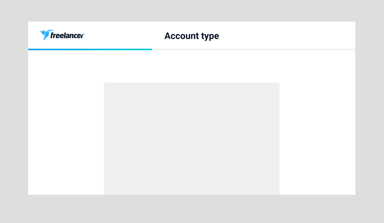
Show progress bars at the top of the page if the content updates as users progress through the stages. Avoid placing progress bars within portions of window frames, such as in tooltips.
Adjust the width of the progress bar to fit in the context of the design.
Default
Height: 6px
For desktop
Thick
Height: 8px
For desktop
Mobile
Height: 350px
Width: 6px, 8px
For mobile
Adjust the height of vertical orientation to fit in the context of the mobile design.
Change the colour of the progress bar depending on design context.
solid: blue-dark (#007fed)
solid: green (#5dc26a)