Card
Wrapping containers for consistently styled cards
In future cards will support more complex inputs, including closeable etc. and more native mobile gesture support. It is a requirement that you use this wrapping component rather than styling an element.
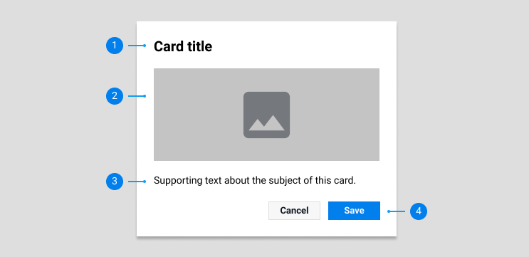
Cards should be easy to scan for relevant and actionable information. Cards can act as a stand alone element, or used to group similar concepts and tasks together. Common usage or cards on Freelancer.com include:
Whilst card layouts can vary to support the types of content they contain, cards used on Freelancer.com should generally follow a hierarchy of information in order to convey a consistent experience for the user across the site.

Header area - high emphasis
The primary point of emphasis for the viewer, and should stand out amongst the other elements of the card so as to be easily digestable in a scanable manner. This could be a project title, or a freelancers profile name and reputation information.
Content area - medium emphasis
Contains relevant content for the subject of the card. This could be a project description or a freelancer’s bio.
Supporting area (if required) - low emphasis
Any low impact, less important content relevent to the subject of the card.
Call to action (if required) - high emphasis
The final action the user is required to take, which can take the form of a button or a link. This could be to award a project to a freelancer, or open a chat dialog.
Examples of card types can be seen in code view.
Default
The default basic card which can contain relevant UI components that are neceassry for the purpose of the card.
Clickable
A card that can is clickable to perform an action or navigation. For use when the card content focuses purely on this action, and must clearly inform the user that this is the card’s intent.
Closeable
Cards that are closeable via a close icon on the top right. For use in instances where a cards content is meant to be dissmissable by the user.
Edge to edge
Cards in which the content of the modal fills the full card, and doesn’t have the padding around the edges. For use on modals that fulfill purely display purposes, such as an image gallery.
Expandable
Cards that contain expandable and collapsible information which can be shown or hidden via a chevron. For use when vertical space may be an issue, or if a card contains a variety of information that you want the user to focus on only one at a time.
The overall size of a card will vary. This can be dictated by a fixed size required by a page design, or responsively scale with the size of a browser window.
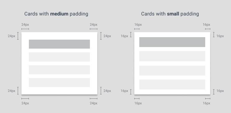
Cards are available with different padding sizes around the edges. The exception to this is the ‘Edge to edge’ modal, which allows content to expand to the borders.
