Button
Clickable elements for anything you want people to click on
Buttons make common actions immediately visible and and easy to perform with one click or tap. They are used primarily for actions such as "Post a Project", "Bid", "Award", or "Accept". Less prominent actions, such as "View More", are executed using plain buttons, which visually resemble links.
Overview
A well-defined button hierarchy enhances usability, streamlines navigation, and controls the prominence of certain actions. In the Freelancer.com Bits Design System, button hierarchy is defined by three levels of emphasis: High, Mid, and Low.
Button Emphasis
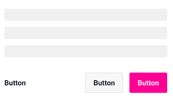
High Emphasis: These are primary actions such as submitting a form or completing a purchase. They are more prominent, have a contained style and use our primary colour.
Mid Emphasis: These are secondary actions like skipping a form or resetting/editing a field. They have a contained style but use the default grey button colour and are less prominent than high emphasis buttons.
Low Emphasis: These are tertiary actions such as providing additional information or canceling actions. They are styled as text buttons and are less prominent than other buttons. Low emphasis buttons can be black or pink. Use black for negative actions (e.g., back, cancel, delete), and pink for positive actions (e.g., edit, skip, upsells, add buttons in widgets).
Links vs. Buttons
Links may resemble text buttons but serve different purposes. Buttons facilitate actions that affect the website's front-end or back-end. Links, on the other hand, are primarily used for navigation and actions that don't alter the website.
Why use a hierarchy?

It helps to prioritize actions and make them more easily discoverable for users. By organizing buttons into a hierarchy, you can make it clear which actions are the most important and should be given the most attention.
It improves the usability of the design. By making it easier for users to understand the purpose of each button and to find the button they need to use, a button hierarchy can help to reduce confusion and make the design more user-friendly.
It creates a more cohesive and visually appealing design. By ensuring that buttons are consistently organized and labeled, a button hierarchy can help to create a design that is visually appealing and easy to navigate.
It helps to make the design system more scalable. By establishing a clear hierarchy for buttons, you can easily add new buttons to the design without disrupting the overall organization and structure of the system.
Tips for labeling buttons
When labeling a button use clear and concise language that accurately describes the action the button will take. Avoid using ambiguous or vague words, such as "OK" or "Continue," and instead use specific verbs that describe the action, such as "Submit" or "Cancel".
Remember to use the same language and phrasing for buttons that perform the same or similar actions, and avoid using different words or phrases for the same action. This will create a cohesive and intuitive design that is easy for users to understand.
Placement
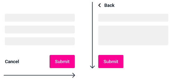
When arranging buttons there are a few key principles to keep in mind:
Within a page
Inside modals

Align buttons with other elements on the page.
This will create a visually balanced and harmonious design, and will make it easier for users to scan the page and find the button they need.
Use white space effectively.
Leaving enough space around buttons will make them more prominent and easier to click on, and will help to create a clean and uncluttered design.
Use only when necessary. This adds in aria-label for links / buttons that doesn't have a descriptive text. For example, a button that only has an icon inside it.
Url used for button link case
Whether to open the link in a new tab in desktop.