Spacing
Whitespace is referred to as negative space or empty space in a page. For the key freelancer interface we prefer a compact UI - this means keeping our usage of whitespace tight where we can do improve the information density of our pages. For instances like marketing pages we use larger spacing tokens to add more breathing room and create a greater impact with our brand storytelling.
Our spacing scales are defined in two categories:
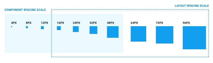
1. Component Spacing Scale
- This scale contains spacing tokens in the range from 4px - 48px.
- Use this scale to build individual elements and components.
- It includes tokens needed to create appropriate spacial relationships for detail-level designs.
2. Layout Spacing Scale
- This scale contains spacing tokens in the range from 16px - 96px.
- Use this scale to arrange components and other UI parts into a pull page layout.
- This scale contains larger increments that are used to control the density of a design.
- Use the smaller layout tokens (16px - 48px) to create more dense components and direct relationships.
- Use the larger tokens (64px - 96px) to increase the amount of white space and to disassociate sections.
Some common use-cases for spacing tokens:
Enum | Value | Common use-case |
|---|---|---|
Enum NONE | Value 0 | Common use-case Mainly for removing margins from smaller screens |
Enum XXXSMALL | Value 4px | Common use-case Used for compact spacing in between text components |
Enum XXSMALL | Value 8px | Common use-case Spacing buttons and text |
Enum XSMALL | Value 12px | Common use-case When 16px may *feel* too large |
Enum SMALL | Value 16px | Common use-case Margins in small modules such as tooltips, margins in showcase cards, user cards and text |
Enum MID | Value 24px | Common use-case Margins in card elements and as margin from the left/right/top/bottom border of the card |
Enum LARGE | Value 32px | Common use-case Margins in modals and big cards that require more white space around the content |
Enum XLARGE | Value 48px | Common use-case Margins in modals and big cards that require more white space around the content |
Enum XXLARGE | Value 64px | Common use-case Extremely large cards for margins such as full view of entries on contest and showcase |
Enum XXXLARGE | Value 72px | Common use-case Used to separate sections on landing pages |
Enum XXXXLARGE | Value 96px | Common use-case Used to separate sections on landing pages and section heroes |
NOTE: Spacing is measured as the distance from element to element. In CSS it might not be exactly the same numbers as in design software. I.e. Text by default have a small margin at the bottom in HTML/CSS which is added to this measurement. In design software the spacing measurements often begin at the text baseline.
Usage
Any component supports a mobile first responsive spacing inputs. Supported margin values are defined by the Margin enum found in @freelancer/ui/margin/margin.directive.ts.
Component
Component
Here's how it works:
Give the example above, the margin of the first element is XXXSMALL by default. From tablet and up, the margin changes to LARGE then changes to XXXXLARGE from desktop and up.
Breakpoints:
[flMarginRightTablet] / [flMarginBottomTablet]: 768px;
[flMarginRightDesktop] / [flMarginBottomDesktop]: 960px;
Other Examples
Component
Component
For the example above, we're utilising the [flMarginBottom] inputs where we'll have a MID margin on mobile then we remove the margin on tablet and add a XXXLARGE margin from desktop and up.
Component
Component
On the example above, we're only setting a SMALL right margin only for tablet and up which means that there is no margin for screens that are smaller than tablets.